Registered User
Joined: 6/30/2017
Posts: 1,227
|
Just sitting here waiting for the opening bell and for the barista to finish my drink (and give me her number ;)
At the recent TC2000 shindig in Chicago last month, I noticed during the breaks that 80-90% of the customers who brought laptops had charts that looked amazingly alike. Sure, different indicators, colors, etc, ... but the overall layout was the same.
And while I didn't ask any of them, I bet if you did ask them why they set it up that way, they either wouldn't have an answer, or say something like "I like it this way".
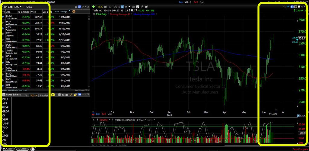
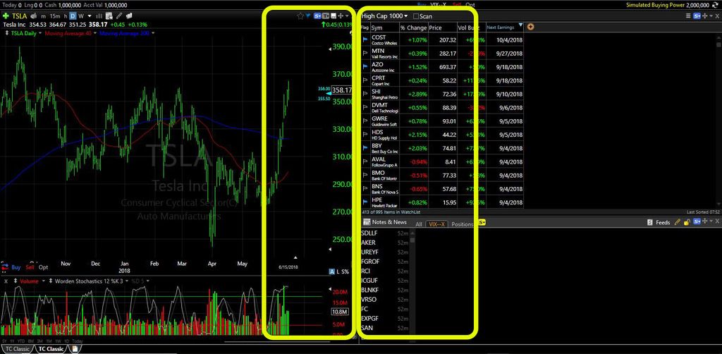
Below are two screenshots of the off-the-shelf TC Classis layout. I'm not picking on Worden - I'm a HUGE fan - but soooooo many folks set up their layout "because that's the way we've always done it".
I'm not talking about multiple monitor setups, just those with one screen (and folks with laptops at Starbucks, LOL).
The first screenshot is the original-original. While all parts of a chart are important, I'd argue that most folks spend more time on the right-edge, which is all the way over on the right-edge of the screen.
As for watchlists, Easyscans, notes, and other text & number heavy windows, I'd argue the most important part of those windows are usually on the left-edge, which is all the way over on the left-edge of the screen.
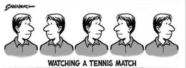
It may not seem like a lot on a smaller laptop screen, but why have your eyes bounce back and forth, from left to right to left to right ... like you're watching a tennis match from courtside?
The second screenshot is the same layout with one small change. I would argue that the most important stuff is now in the middle of the screen, which makes for quicker analysis, and saves on eye strain, to boot.
Different strokes for different folks. You may think this is stupid. That's okay. The barista just gave me her number, and she's HOT :)
Just don't do something because the crowd does it - y'all know how that works in financial markets.
- Al_Gorithm
You can call me Mr. Al Gorithm, Algo, or Al - just don't call me late for dinner!


|